Works Details
- UX
- In-Depth Interview, UX Concept Building, UI Concept Building, User Flow, Lo-Fi Prototyping, Wireframing, UI Design, Sketch
- Tech
- HTML5, CSS, CSS Preprocessor, Web/App Accessibility, SEO, RESTful API
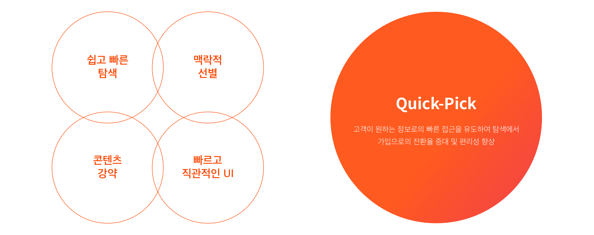
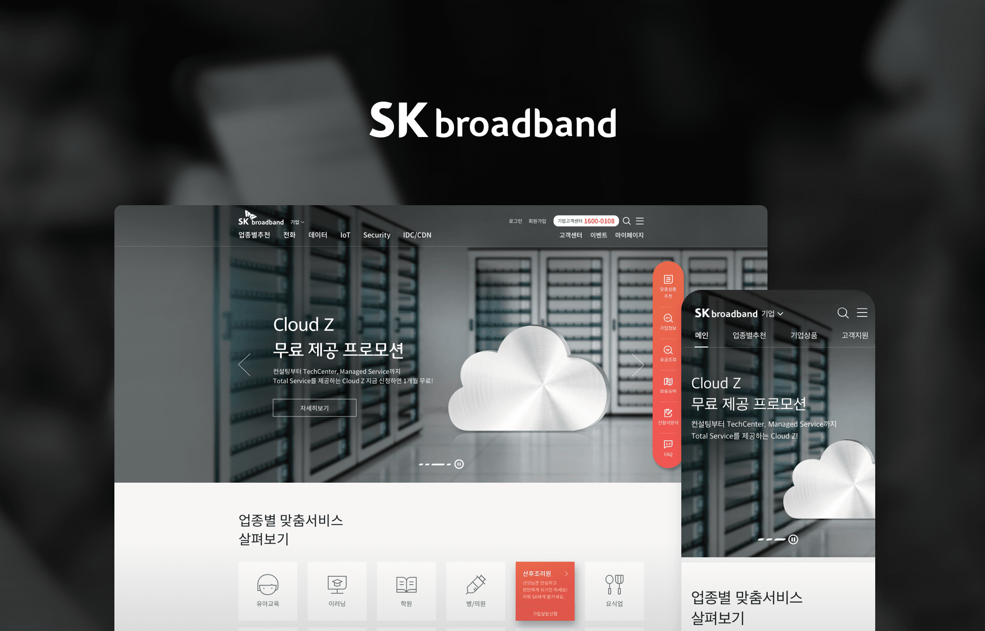
Break from the text-based supplier-oriented structure of contents, it has been constructed with the behavior responding UX/UI structure to provide customer-oriented information and easy use of services so its customer is now allowed to make its intended search in every device in the fast and easy manner. We have managed to create the intuitive UI which can consider the given mobile environment and devise a priority list of contents through the contextual selection. Under the UX concept called ‘Quick-Pick’, integrating from the site navigation to the post-use stage, we are trying to increase a conversion rate of customers as well as their convenience.
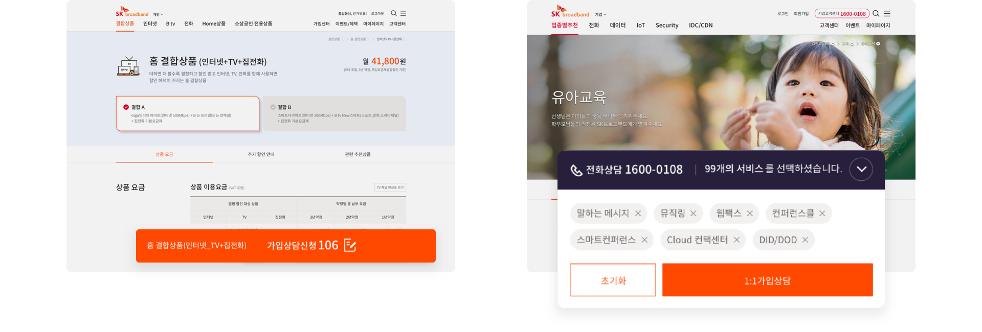
Based on the refined and moderate color, red and orange colors of SK Broadband are used to differentiate between personal and corporate channels and gradation color is used to suggest a service to its user.

Using the Pictogram, reflecting the logo of SK Broadband, a harmonious blend of straight lines and curved lines, it is possible to raise its user’s understanding while raising its brand identity.
By redefining the complicated images and texts with abstained visual and wording, it raises the understanding of information. Considering the environment and operation issue for each channel of SK broadband, its visual strategies have been defined. For personal channels, using singular objects and icons to let viewers focus on information, while images are exposed for corporate channels.

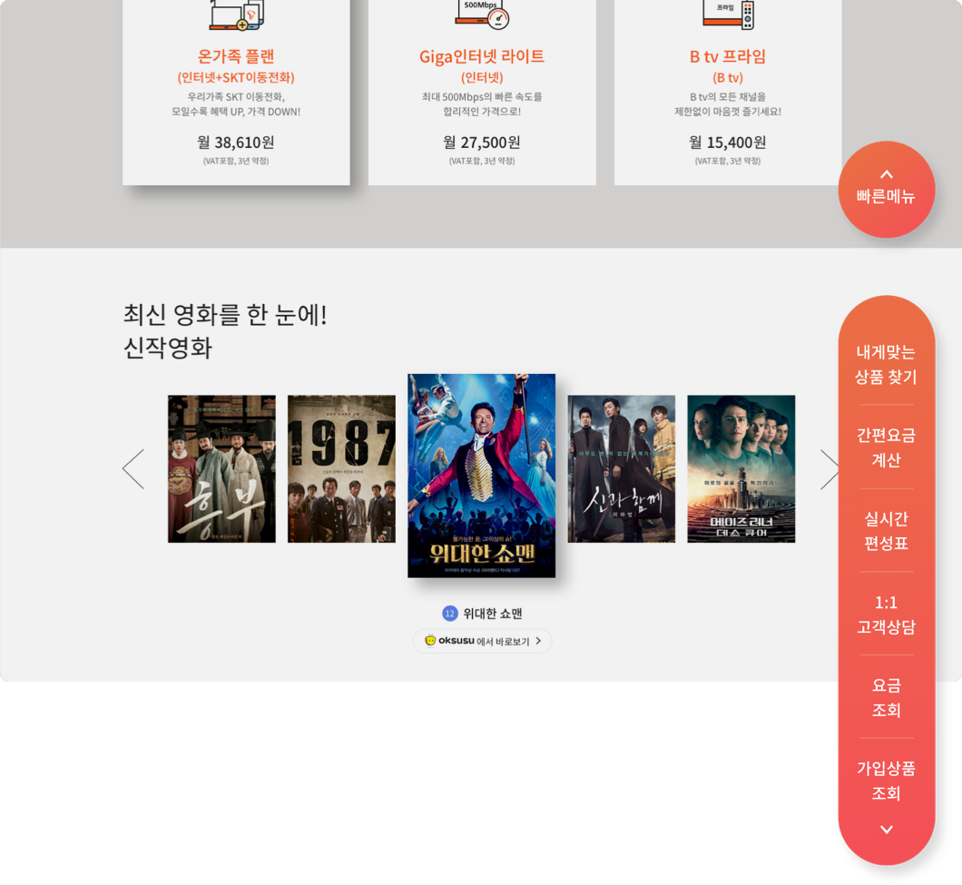
On its mobile website, we have focused on how to reduce its stage, through path-optimizing. The main big banner, shown before log in, has been designed to provide various promotional activities and the big banner, shown after log in, to visually present the information of My Page.
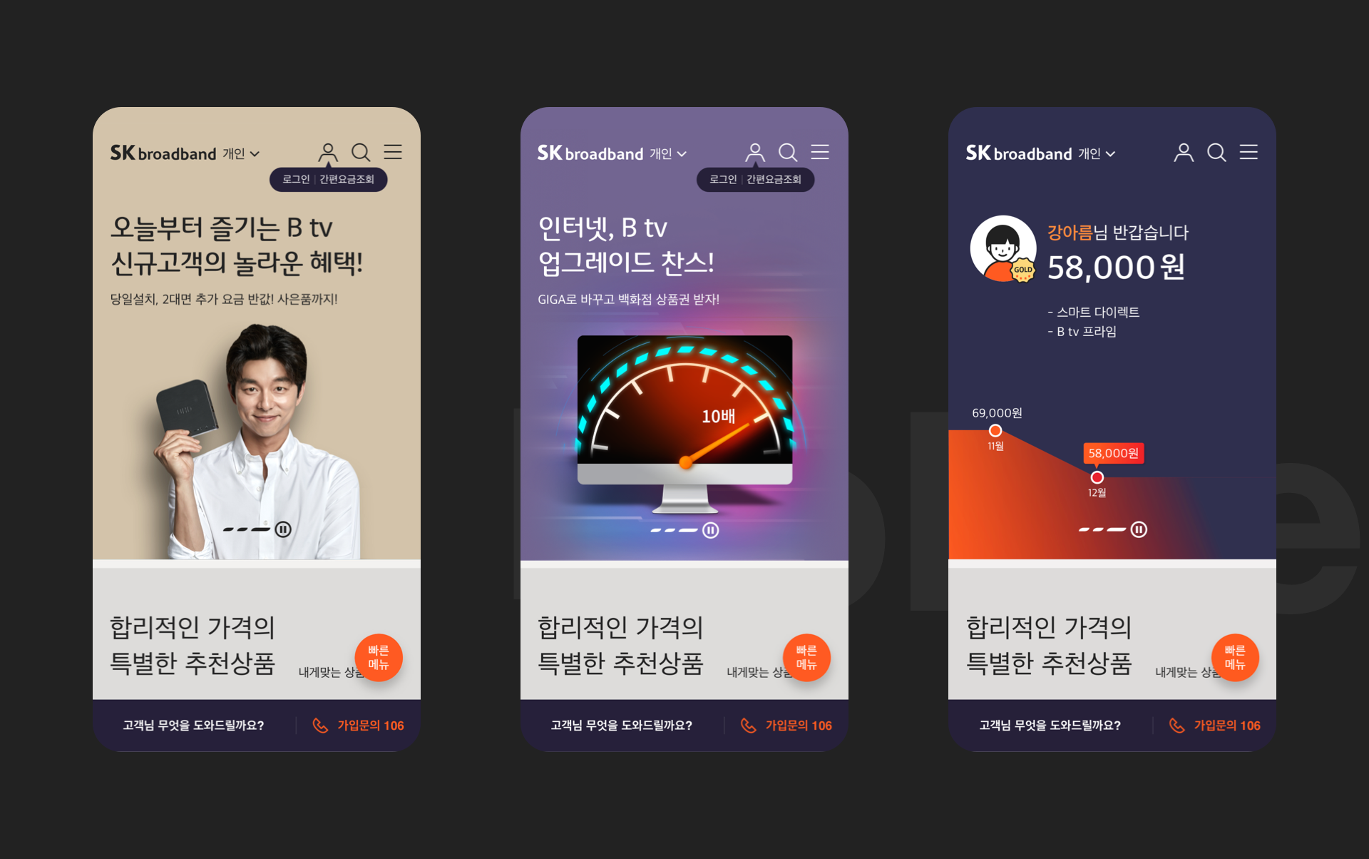
Quick menus exposed in the previous main menu have been modified, and different Quick Menus are provided to users before and after log in.
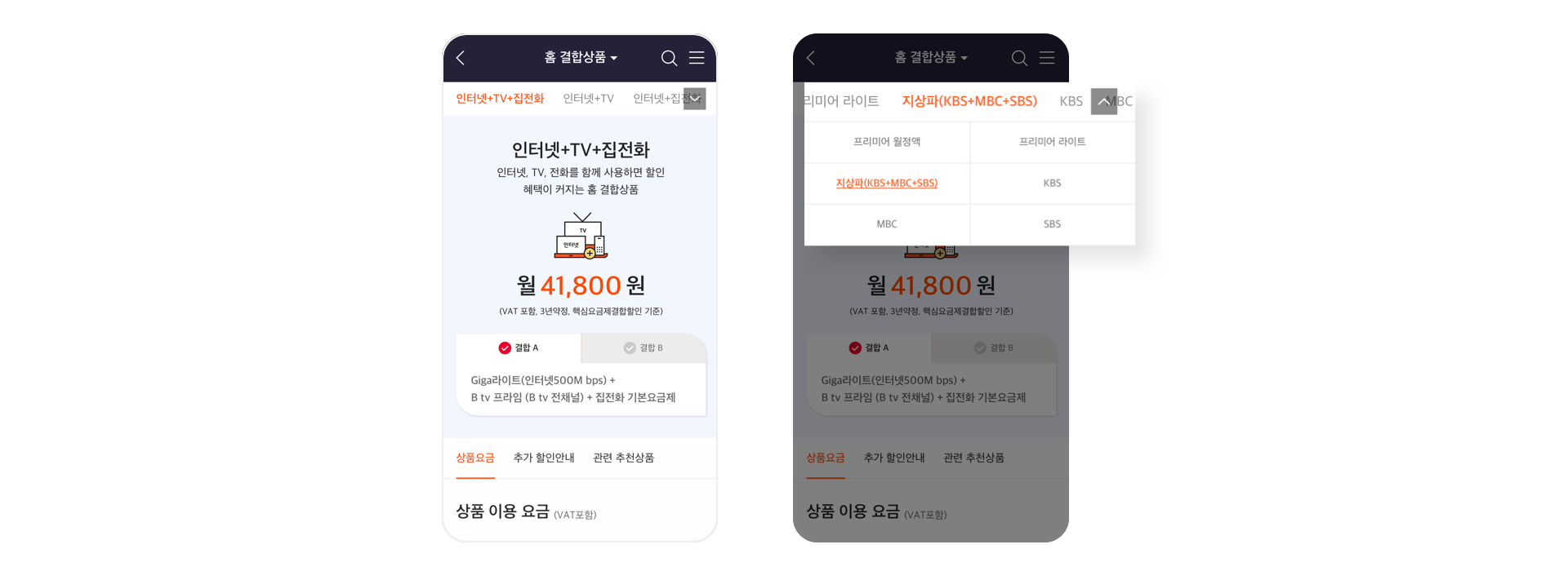
It is now allowed to easily search a product using Quick Filtering / Quick Find / Sticky Menu. Different menus are exposed for each different page and a consultation UI is fixed to induce to apply for the consultation for subscr-iption.
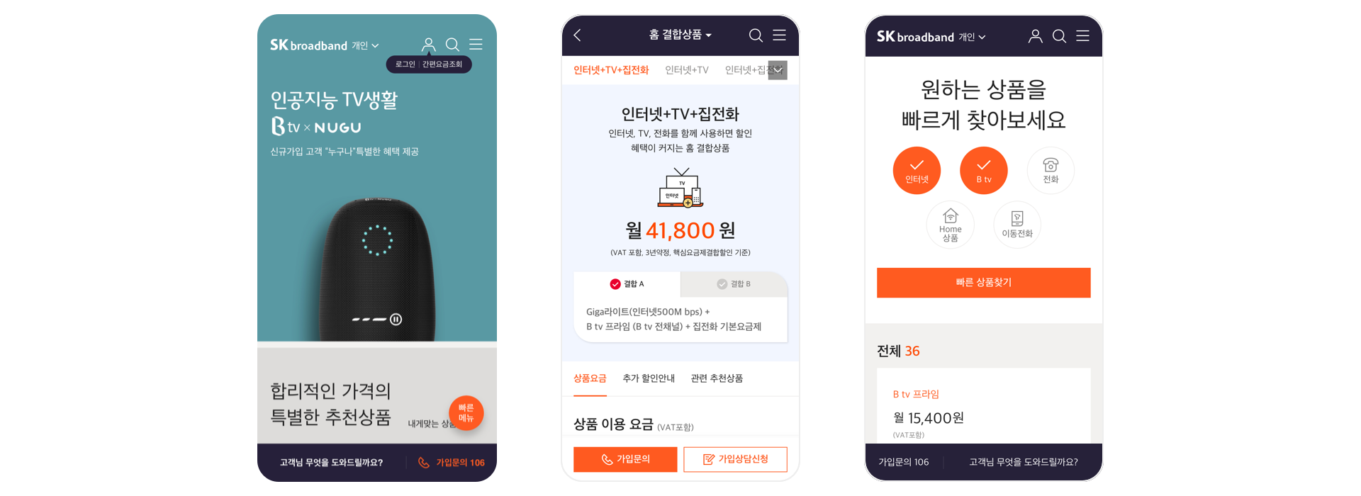
On the website, we have focused on how to make it easier to find, through path-finding. Products are now arranged on the 1-depth menu for the GNP menu so a user could check them at once, and marketing has been added to suggest a customer of a service.
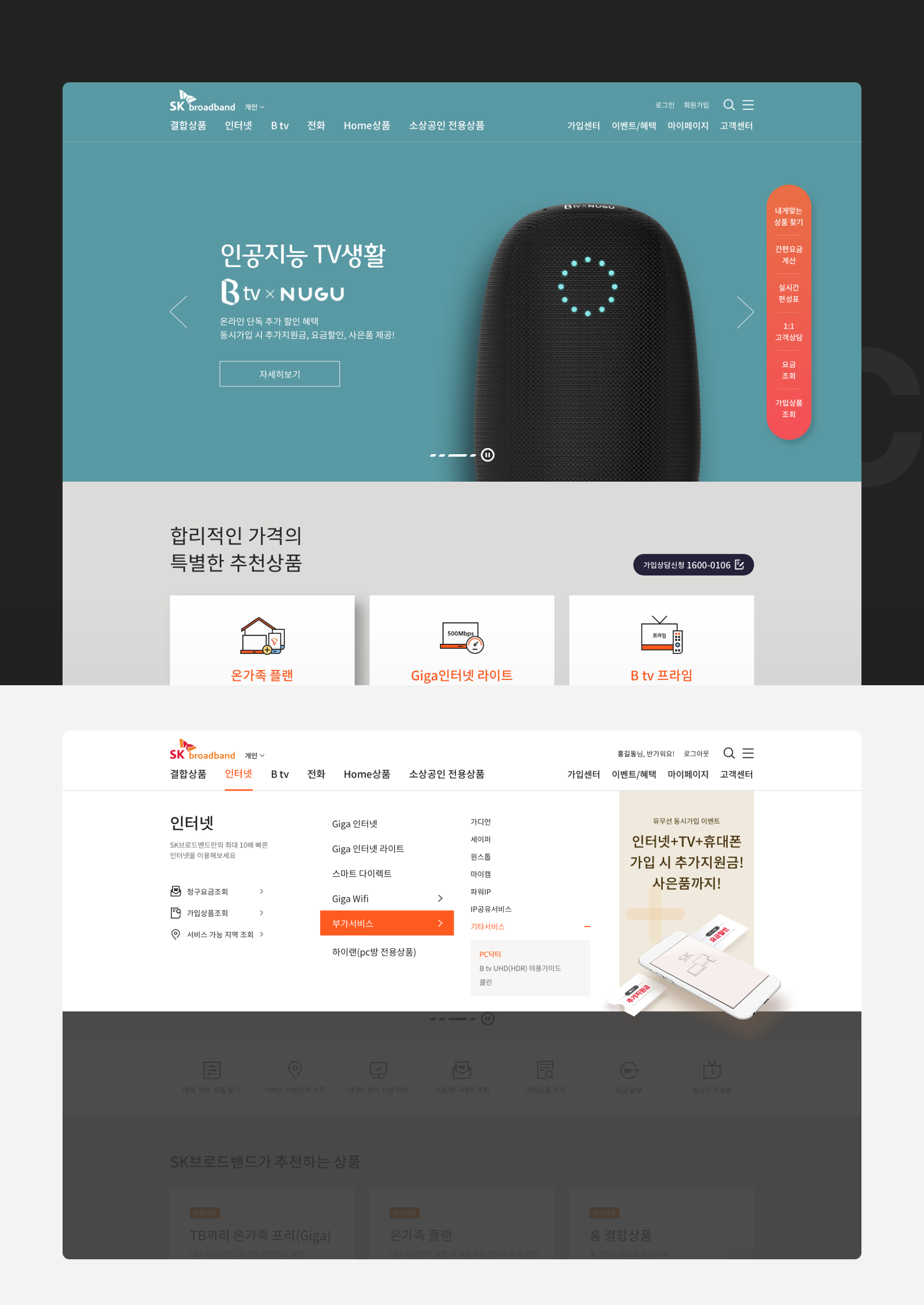
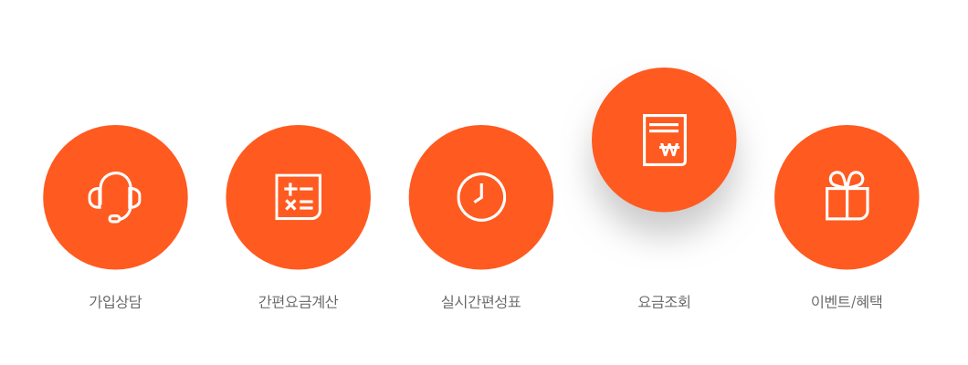
Using the Quick Menu, contents which are frequently used by customers are arranged individually so customers could easily and quickly access to the desired products.
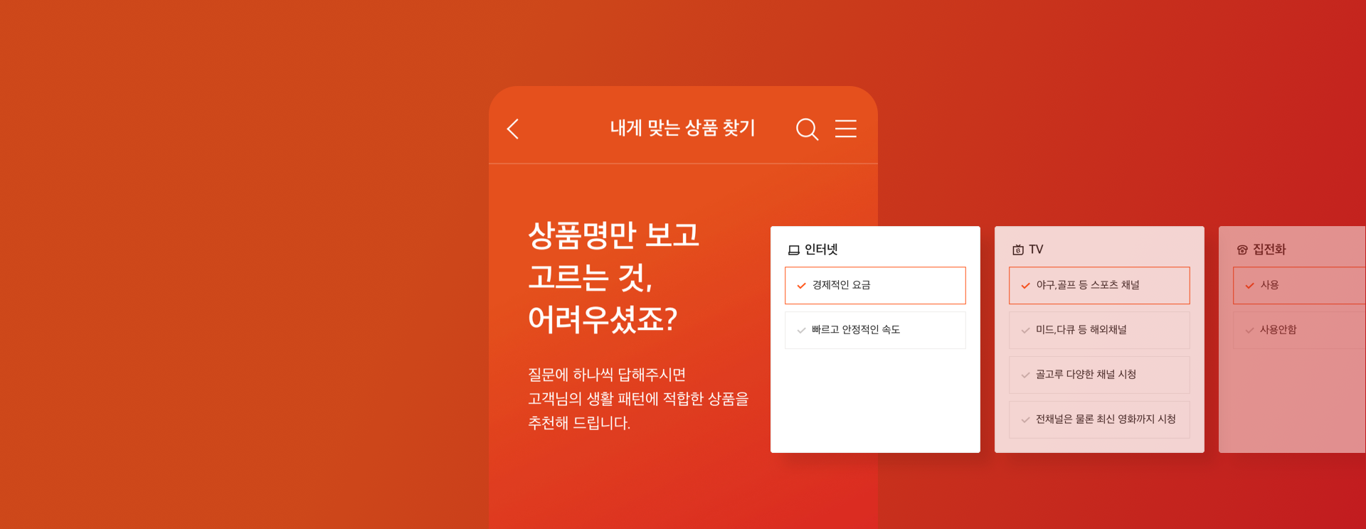
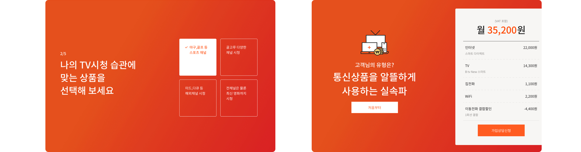
It has provided a service with which customers could easily compare and search the desired products while enhancing the accessibility of its contents. In order to reduce a feeling of objection to the products and lead to the actual sales, we have arranged ‘find a suitable product for me’ and ‘easy price calculation’ features in integration with products.
In order to allow customers to have the consultation for subscr-iption at any time, the consultation UI has been arranged to get exposed all day by using the Sticky UI structure.
Credits
-
- Project Manager
-
Lee Yongju
- Creative Director
-
Kim Youngsun
- UX Designer
-
Son Moonsuk, Kim Deokrim, Ahn Byunghoon, Kim Hyerim, Mun Hyeyeong, Kim Migyeong, Park Jihye
-
- UI Designer
-
Park Joohyun, Choi Wonyoung, Seo Jihee, Kang Areum, Lee Sieun
- Interaction Designer
-
Kim Gisang, Yoo Jungsun
- Front-end Developer
-
Kim Duil, Kim Seungil, Kim Gilchae, Jung Eunseon
Link
Website