Works Details
- UX
- In-Depth Interview, UX Concept Building, UI Concept Building, User Flow, Lo-Fi Prototyping, Wireframing, UI Design, Sketch
- Tech
- HTML5, CSS, CSS Preprocessor, Web/App Accessibility, SEO, RESTful API
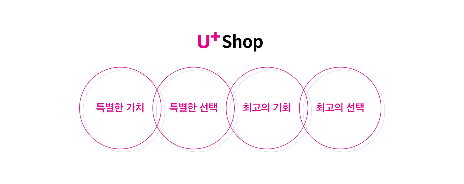
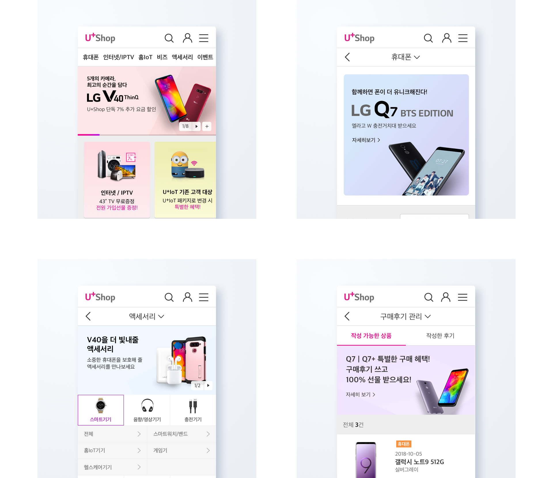
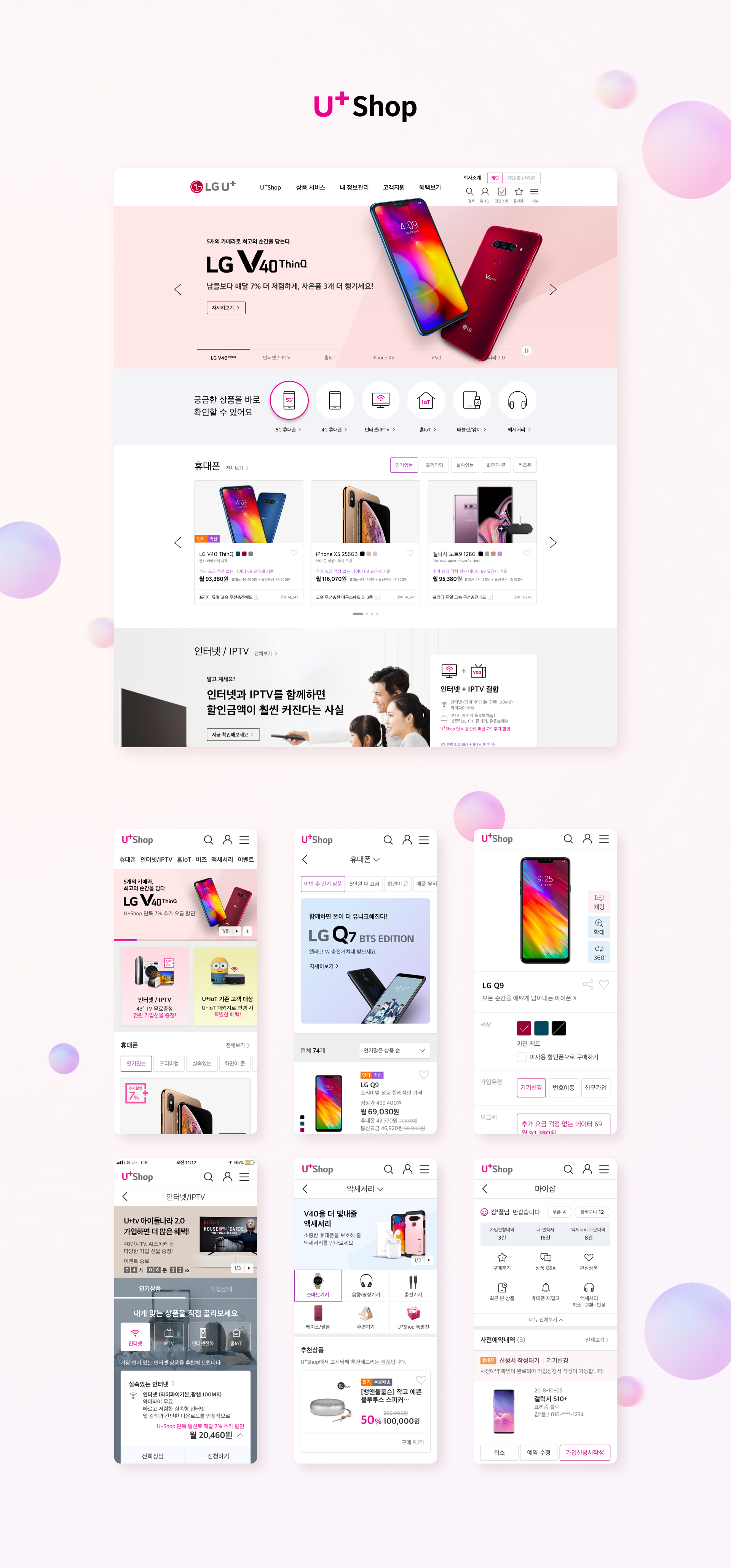
Noting "customer-tailored products" and "customer-optimized convenience," the company has newly built LG U+Shop based on four keywords. It focuses on providing customized information that customers want, and inducing them to purchase customized products, and provides information configuration and subscr-iption convenience that are optimized for purchasing decisions so that customers can make the best choice.

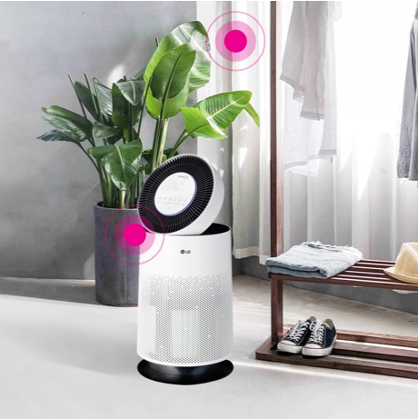
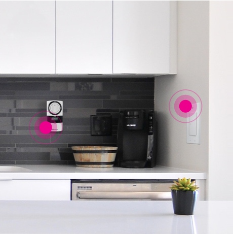
LG U+Shop is providing home IoT experience services and Internet/IPTV simulation content so that customers can have a special experience.
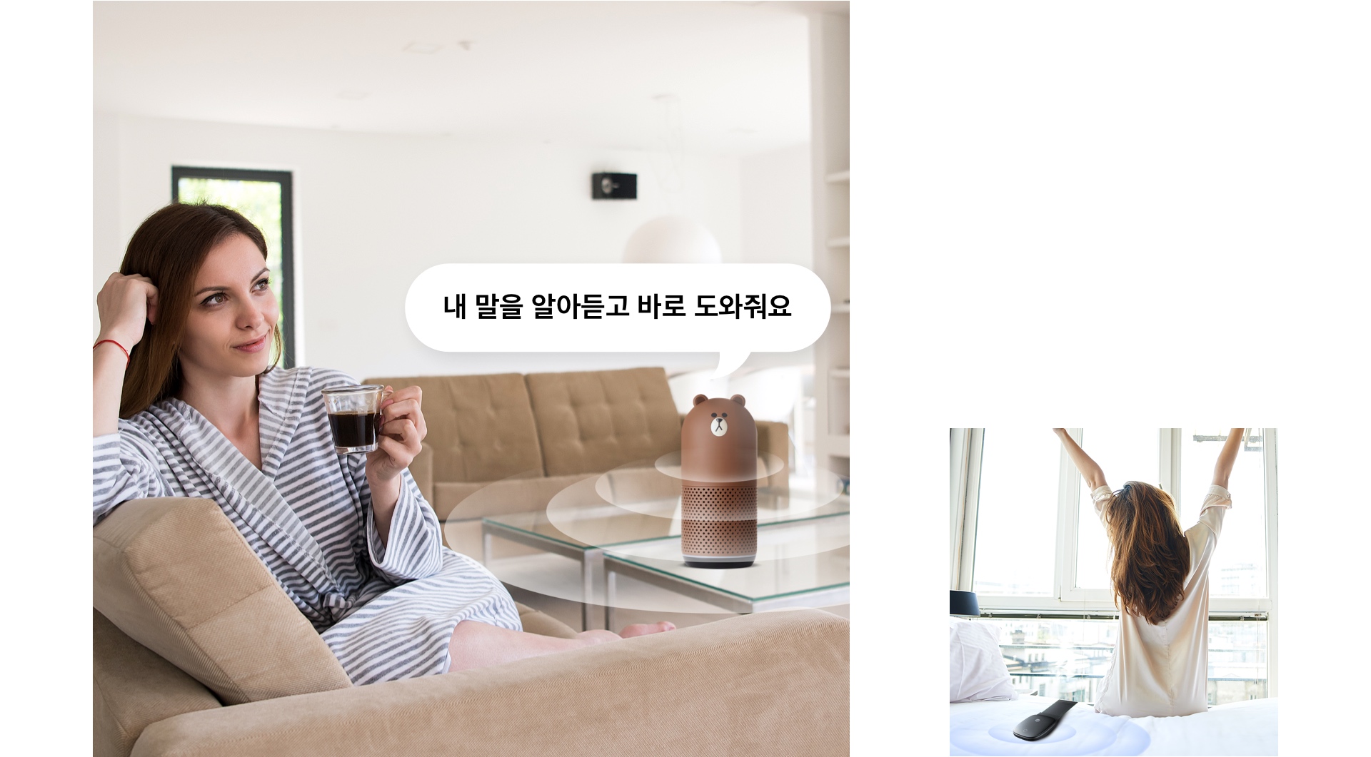
The purpose of the project was to create a consensus among the customers by providing the characteristics of the home IoT products as a variety of contextual content.
It was induced to solve service questions when using the home IoT by establishing a home IoT experience story to check the vivid spent period of the actual purchasers.
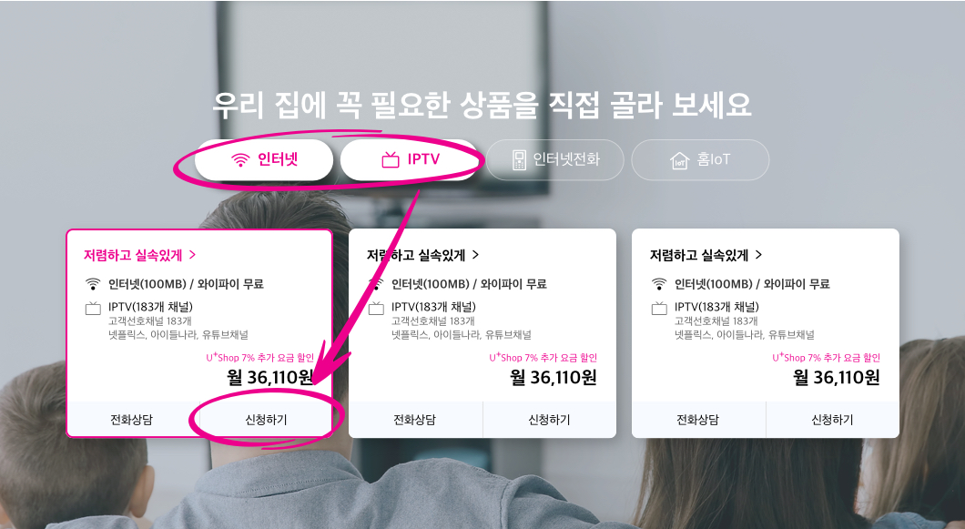
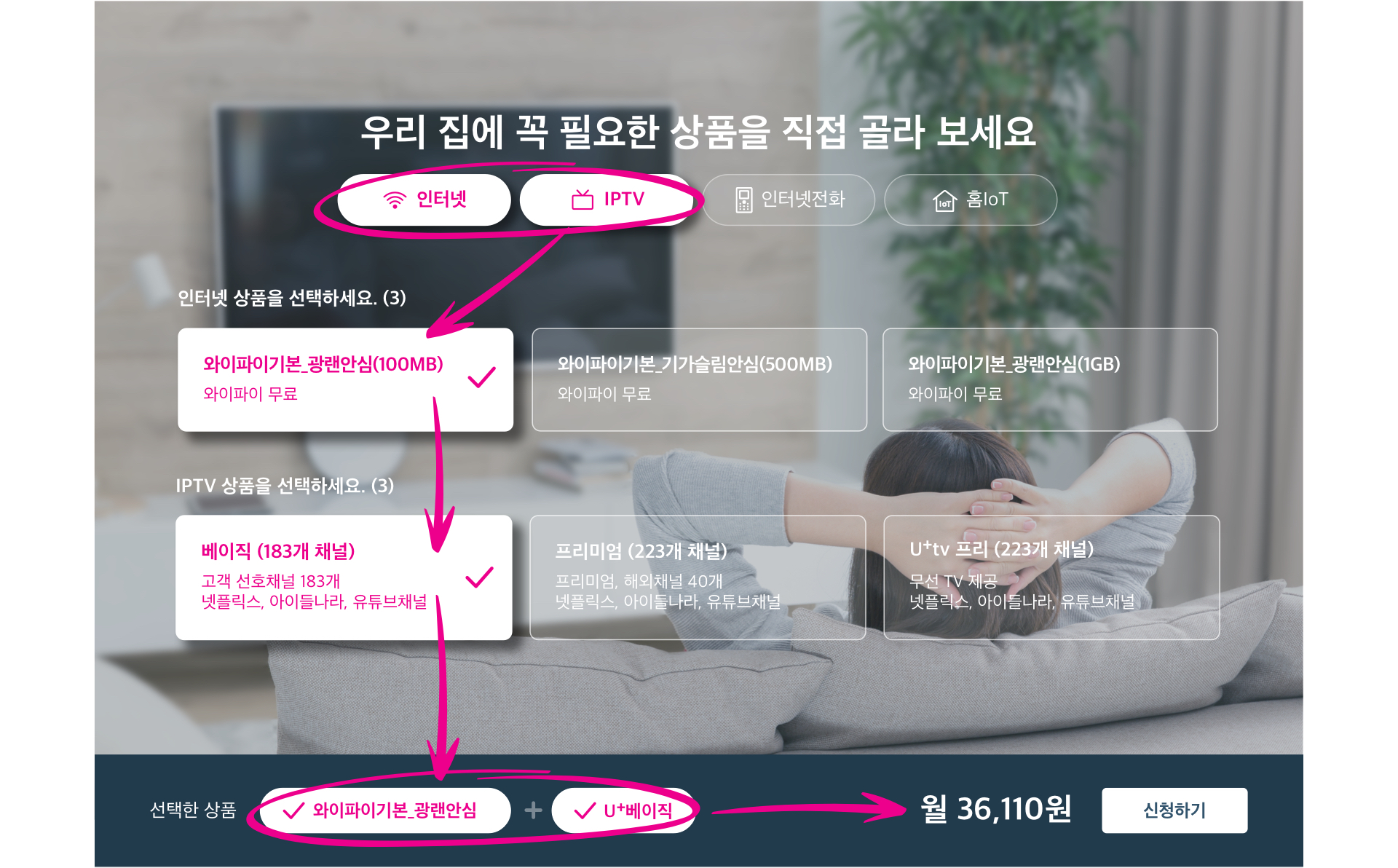
Through Internet/IPTV simulations, the combined products can be recommended and customers can choose the products they need.

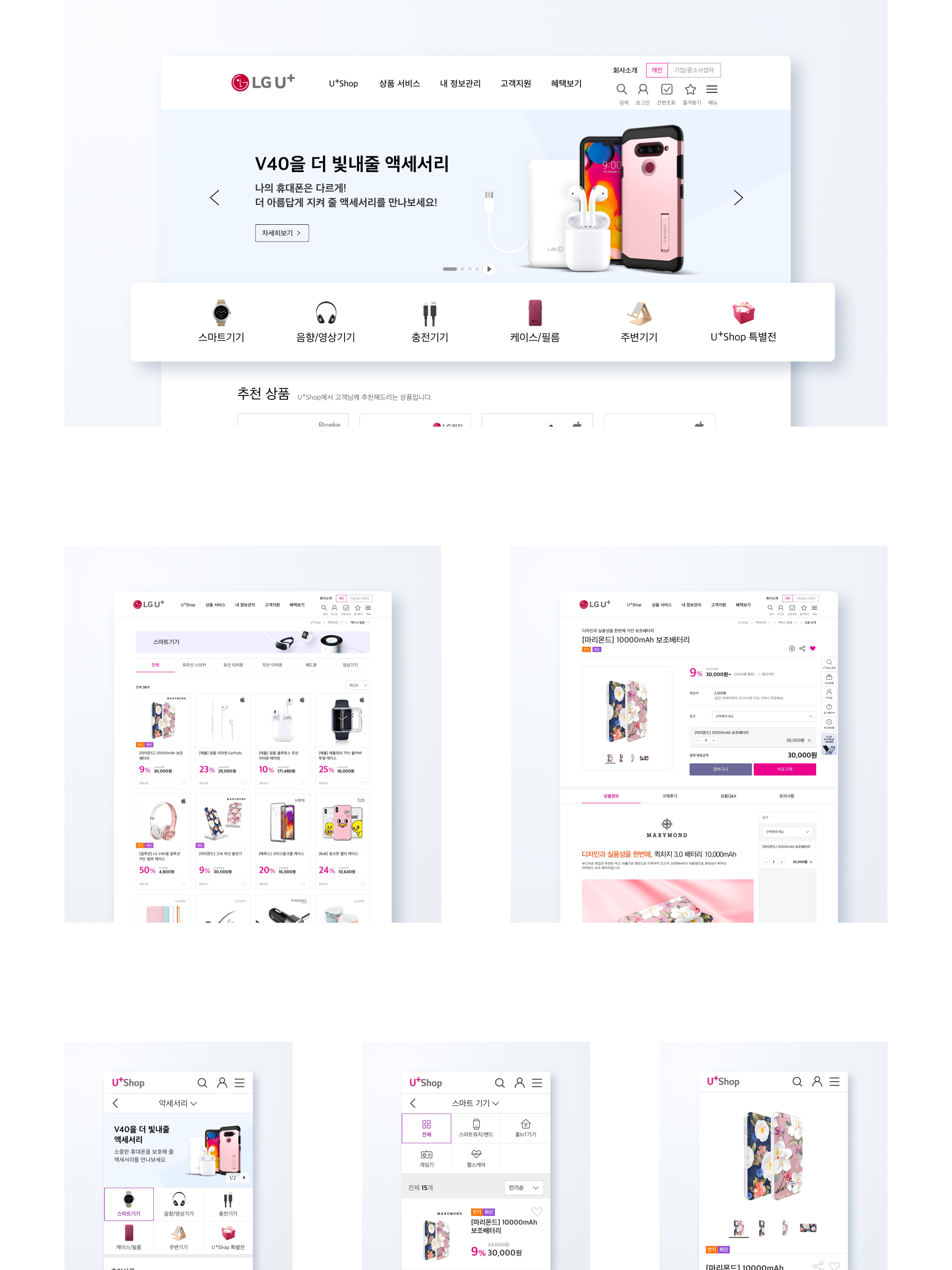
LG U+Shop is offering a wide range of accessory products by creating a new accessory channel that has not been available before. The accessory category area is located at the bottom of the main visual, so that the desired accessory product can be found.

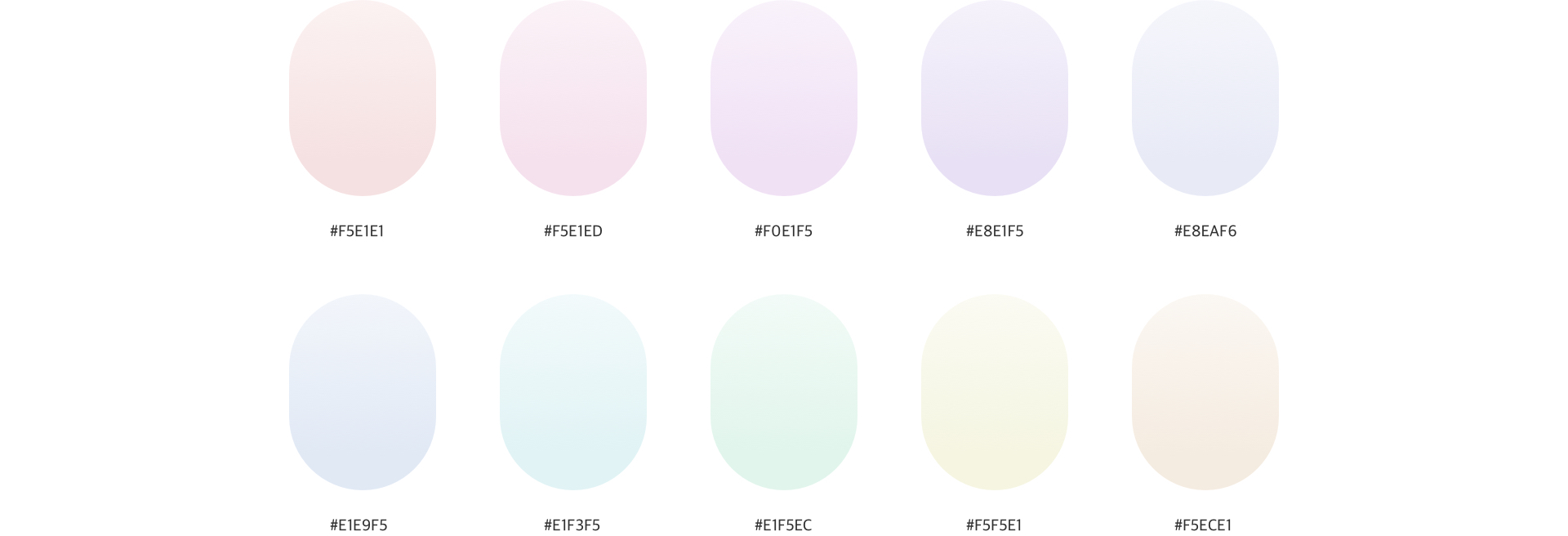
LG U+Shop's promotion banner is equipped with dynamic elements that can be directed at various situations so that customers can focus more on the promotion of U+Shop.
To clearly show the promotion, LG U+Shop used the background color as a light tone of pastel to improve the existing complex promotion banner design.


LG U+Shop has improved modules for mobile phones, Internet/IPTV, home IoT and accessories on product information that customers want.
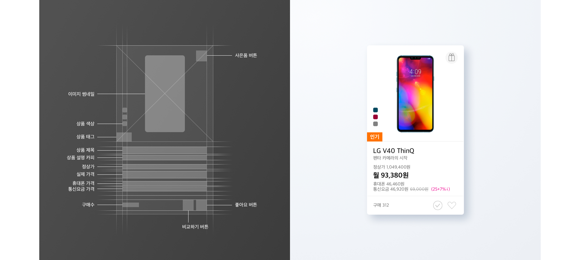
Items important to customers' purchase purpose and purchase decision were provided as filtering functions, so that products could be quickly explored and accessed.
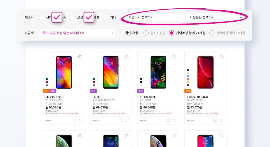
Up to three devices on the mobile phone and tablet list can be added to the comparison, and the comparison results can be seen at a glance.
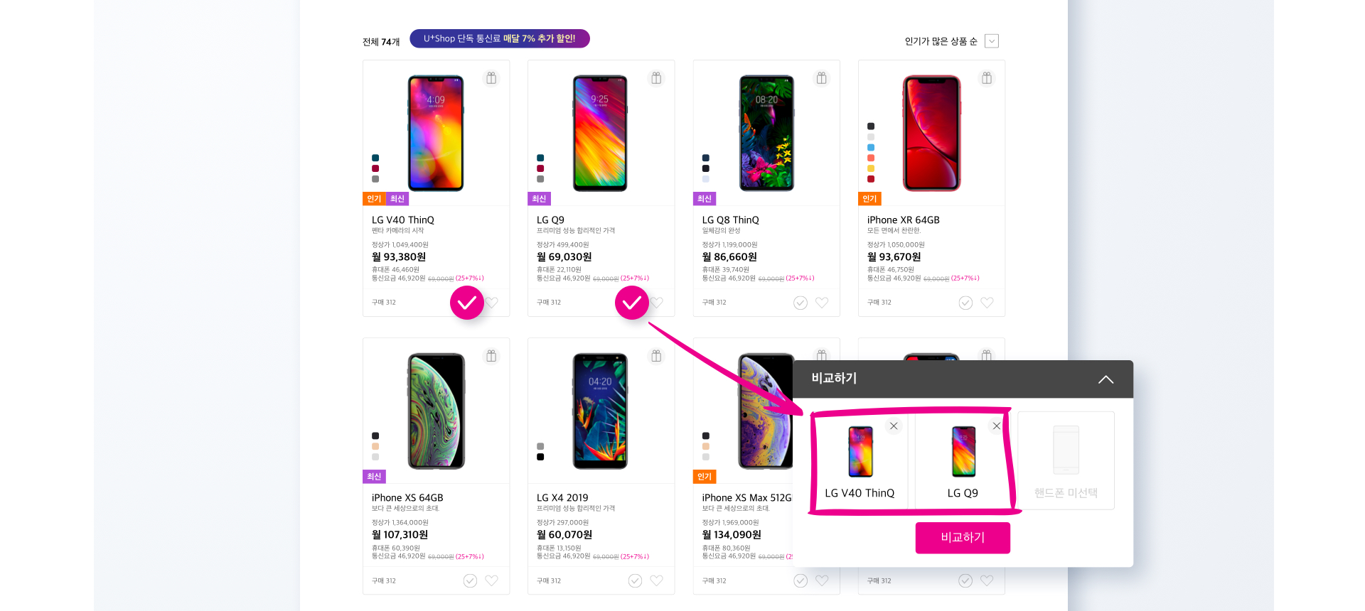
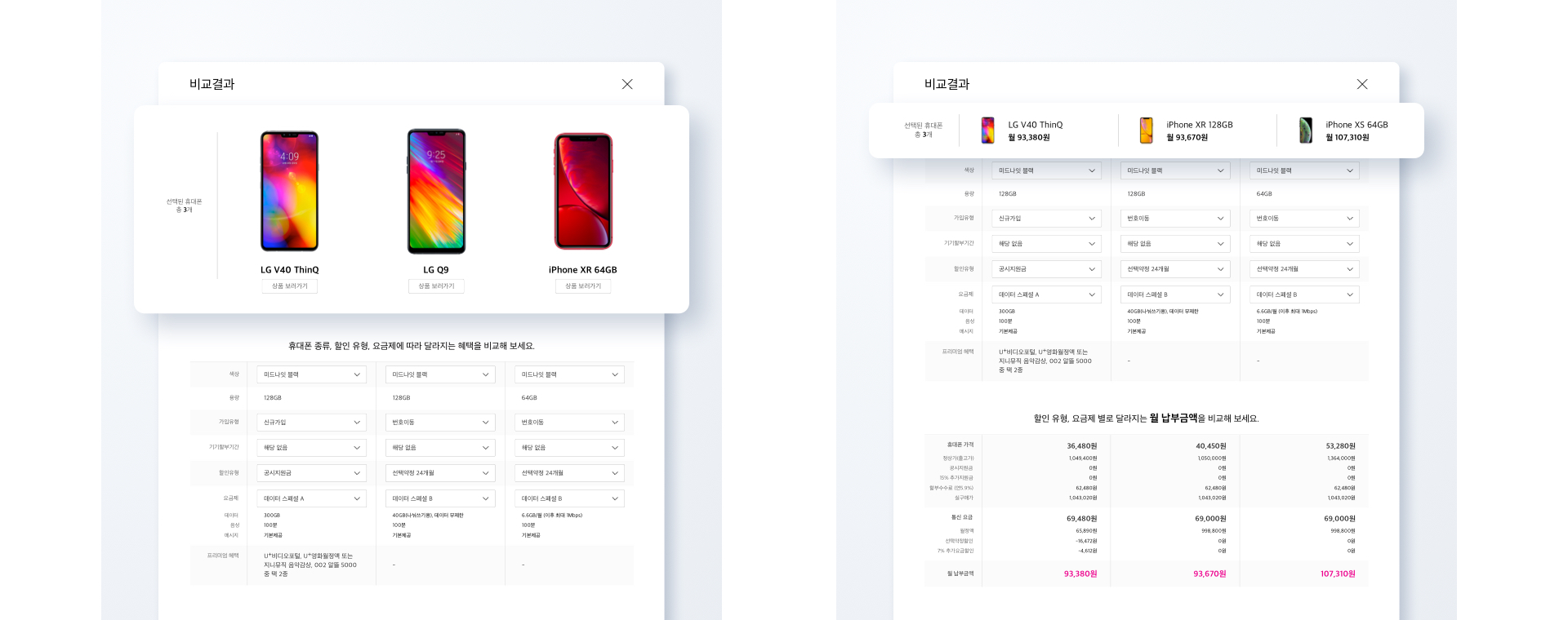
In the comparison results, additional choices such as spec information, discount type/fee system, installment period/additional service benefit information were made to enable users to purchase mobile phones more conveniently than before.
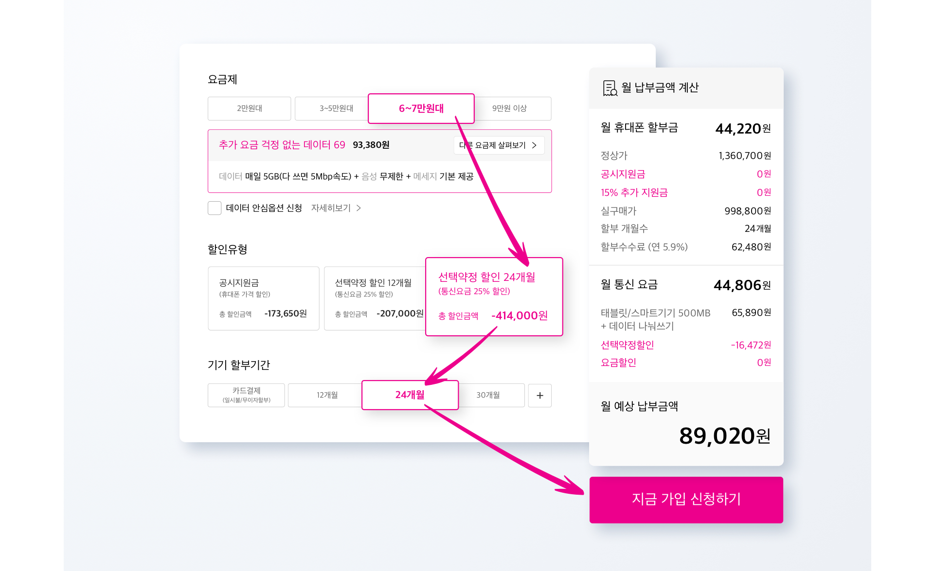
When you try to subscribe to a product, you can check the amount in real time through a monthly payment calculator and simulate various benefits.
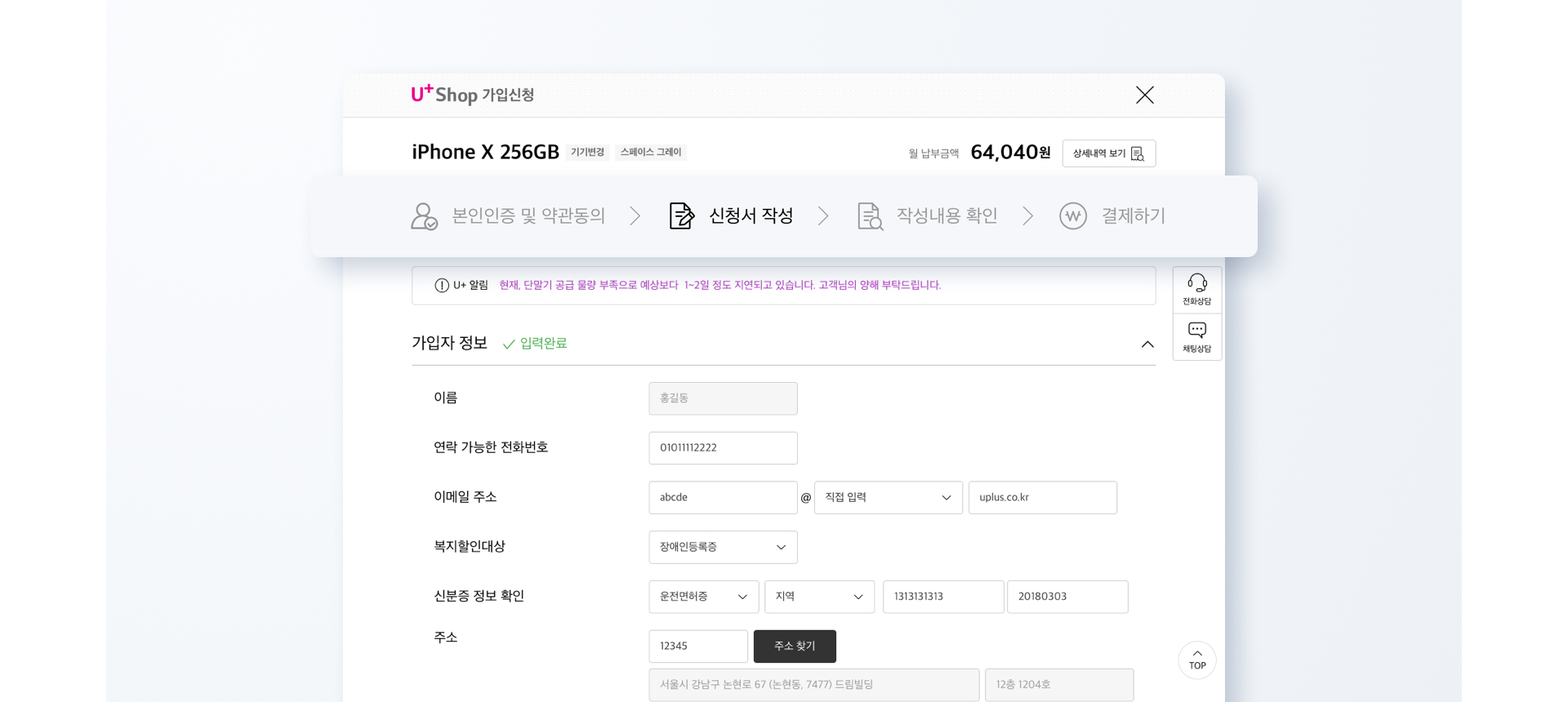
Completing the sign - up application process was made as easy as possible by simplifying the steps and entry items. For mobile phone channels, the level was reduced from 10 to 5 and the number of entries was simplified from 22 to 13 to greatly enhance customer convenience.
Credits
-
- Project Manager
-
Son Moonsuk
- Creative Director
-
Jin Sujin, Lee Nagyeong
- UX Designer
-
Park Jonghyeon, Koo Minyeong, Park Jihye, Jang Yeonji, Kim Hyeyeon, Ahn Jiwon, Yoon Chiseong, Kim Jihyeon, An Hyeri
-
- UI Designer
-
Kim Hyeri, Kim Sohee, Hong Jeonghyeon, Lee Bulhwi, Park Jongkyoung, Lee Sihyeon, Kwon Hyejin
- Interaction Designer
-
Kim Gisang, Yoo Jungsun, Cha Seunghong
- Front-end Developer
-
Kim Duil, Lim Donggu, Yoon Mireu
Link
Website