Works Details
- UX
- UX Concept Building, UI Concept Building, User Flow, Lo-Fi Prototyping, Hi-Fi Prototyping, Wireframing, UI Design, Framer, Proto.io
The previous UGI of CJ O Shopping failed to reflect the nature of CJ O Shopping, promoting the shoppertainment strategies. In the future, CJ O Shopping is planning to merge with CJ E&M, delivering the taste of the public with cultural contents. Create a new graphic format of CJ O Shopping, which would lead the taste of the public with its cultural contents to the home shopping industry.

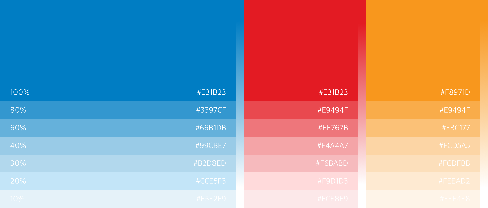
Using the point color of CJ and blossoms as its motifs, we have established the graphic identity of CJ O Shopping. Based on its standard color and sub color, we have devised a color guide that could be suitable with its contents along with graphic styles that reflect a lively atmosphere of CJ O Shopping.

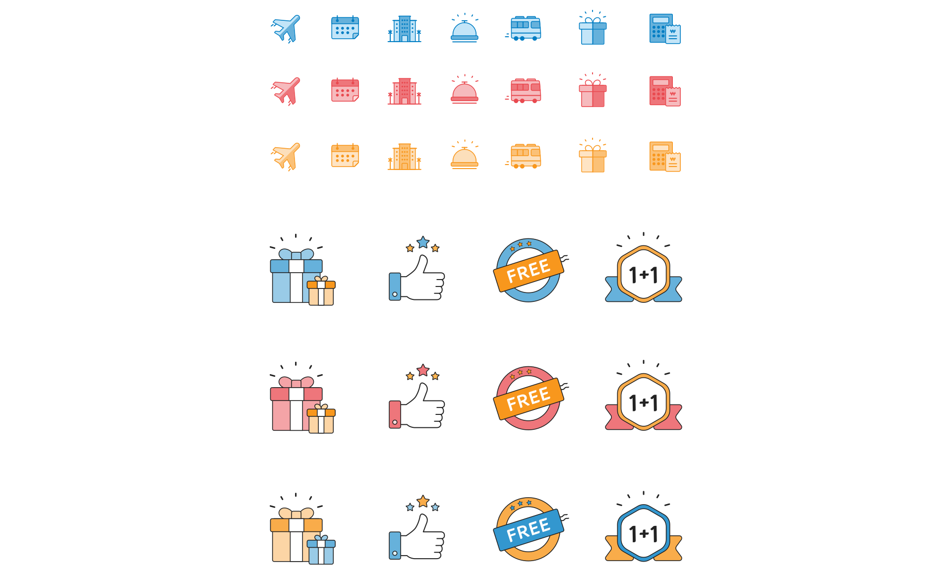
Instead of using glamorous and colorful graphics, it uses dots, lines, and faces to stay with basics and to focus on its contents. Presenting a flexible image of CJ O Shopping by reflecting the identity of its logo.
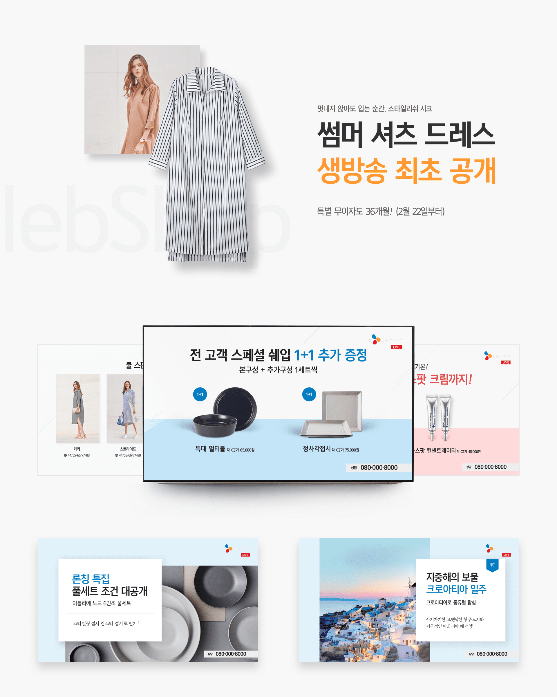
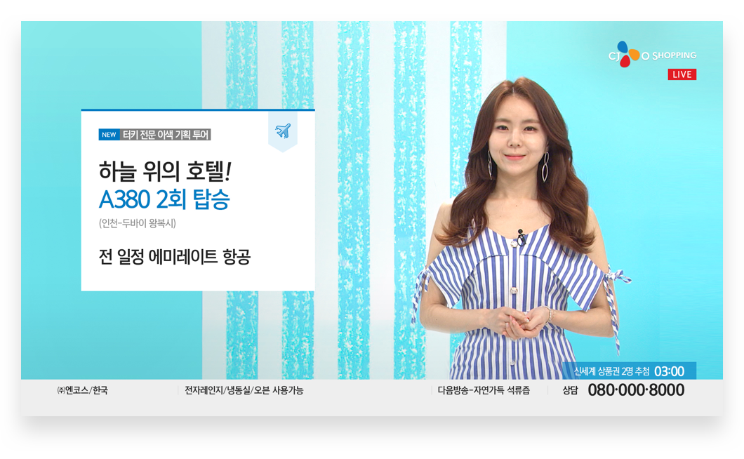
The Z-shaped flow line, considering the flow of sigh, provides an opportunity for unconditioned information search and to induce a purchase. While providing a lot of information on the live screen, in considering the nature of a home shopping channel, a main copy and a price are emphasized so users can easily check the most important information at once, leading to a purchase.
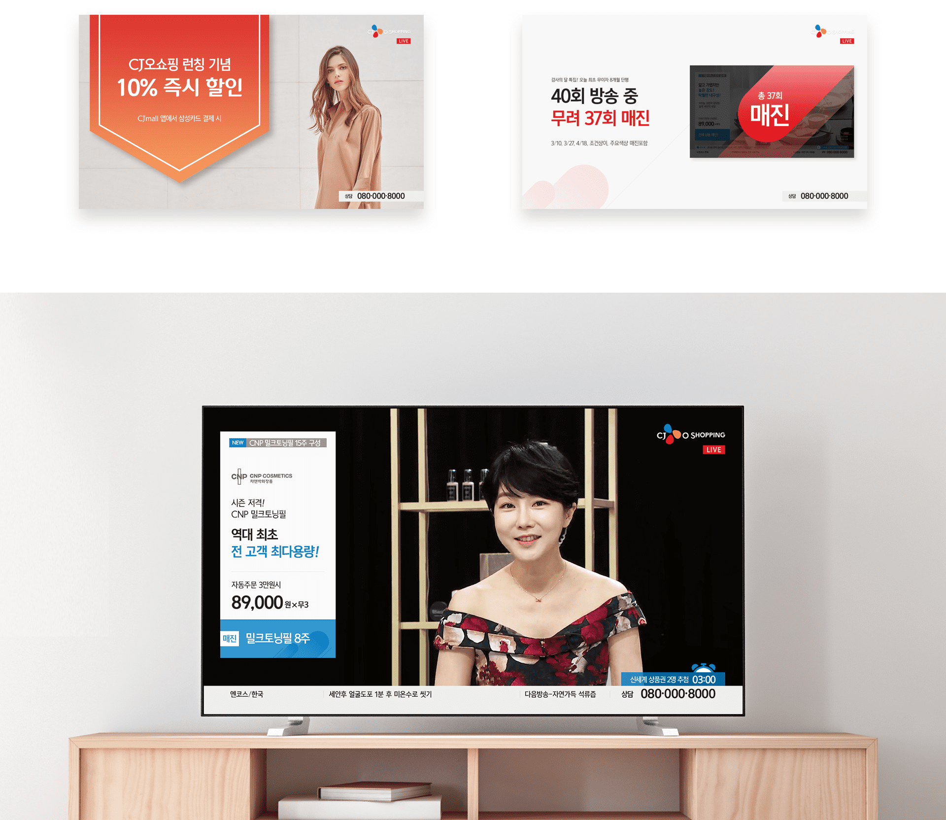
With a simple, intuitive, and flexible design, presented information could be perceived at once. With the L-bar-shaped design, less information is given so viewers could perceive only the most important information at once, promoting a detailed search.
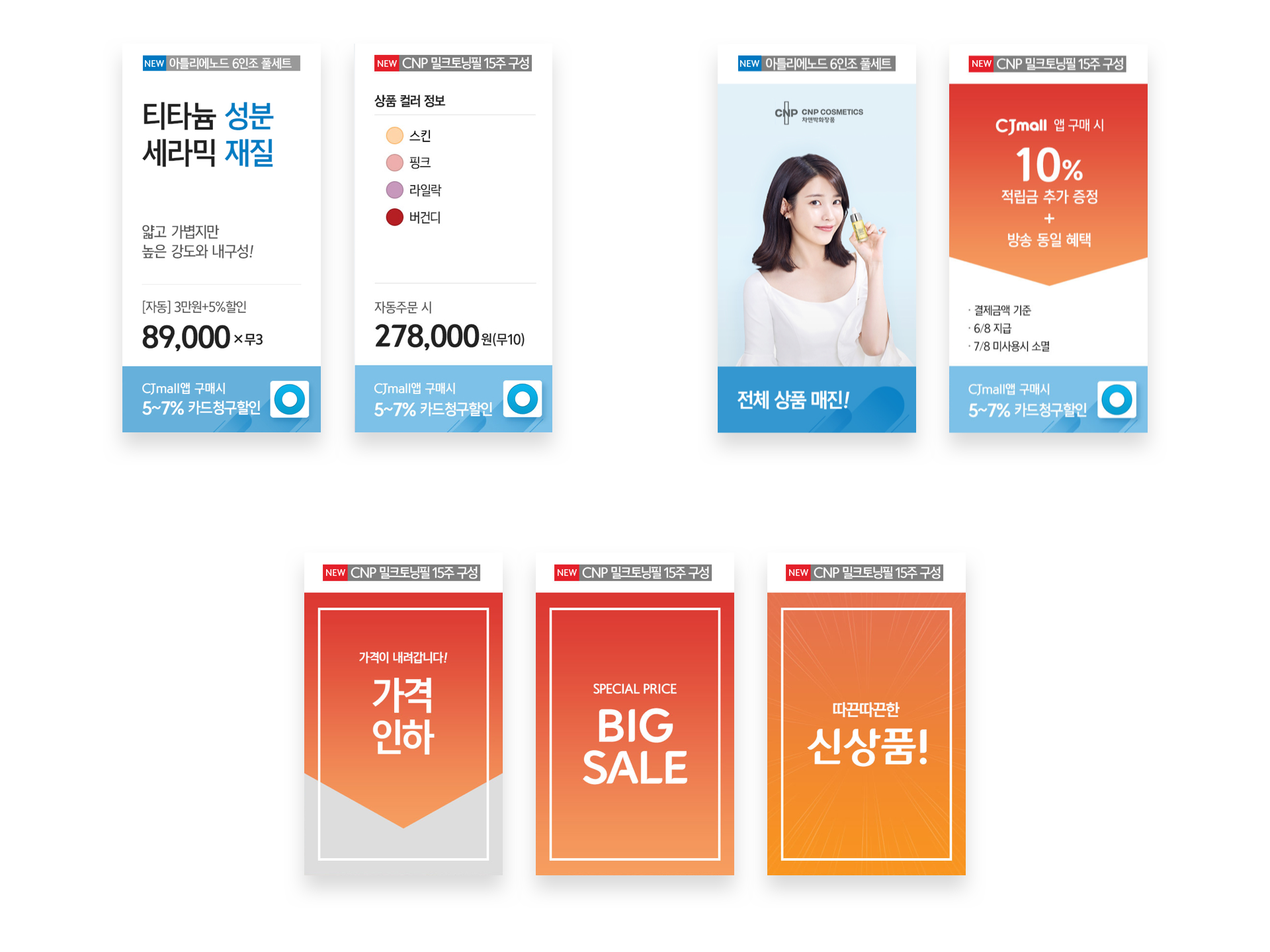
Constructing various page designs: a front page design presenting mainly with images of products and conditions, a general front page design presenting information mainly in texts, a front page design presenting a full-size image and a title text, and a front page design for effectively presenting the images of products of a certain category.
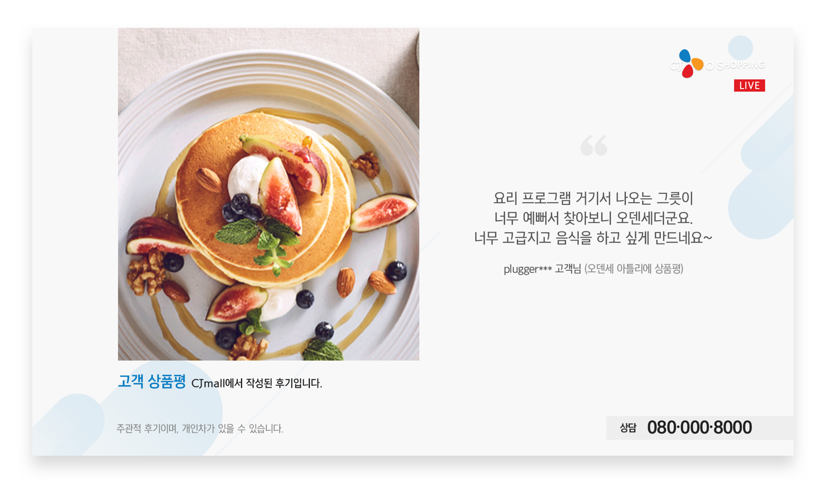
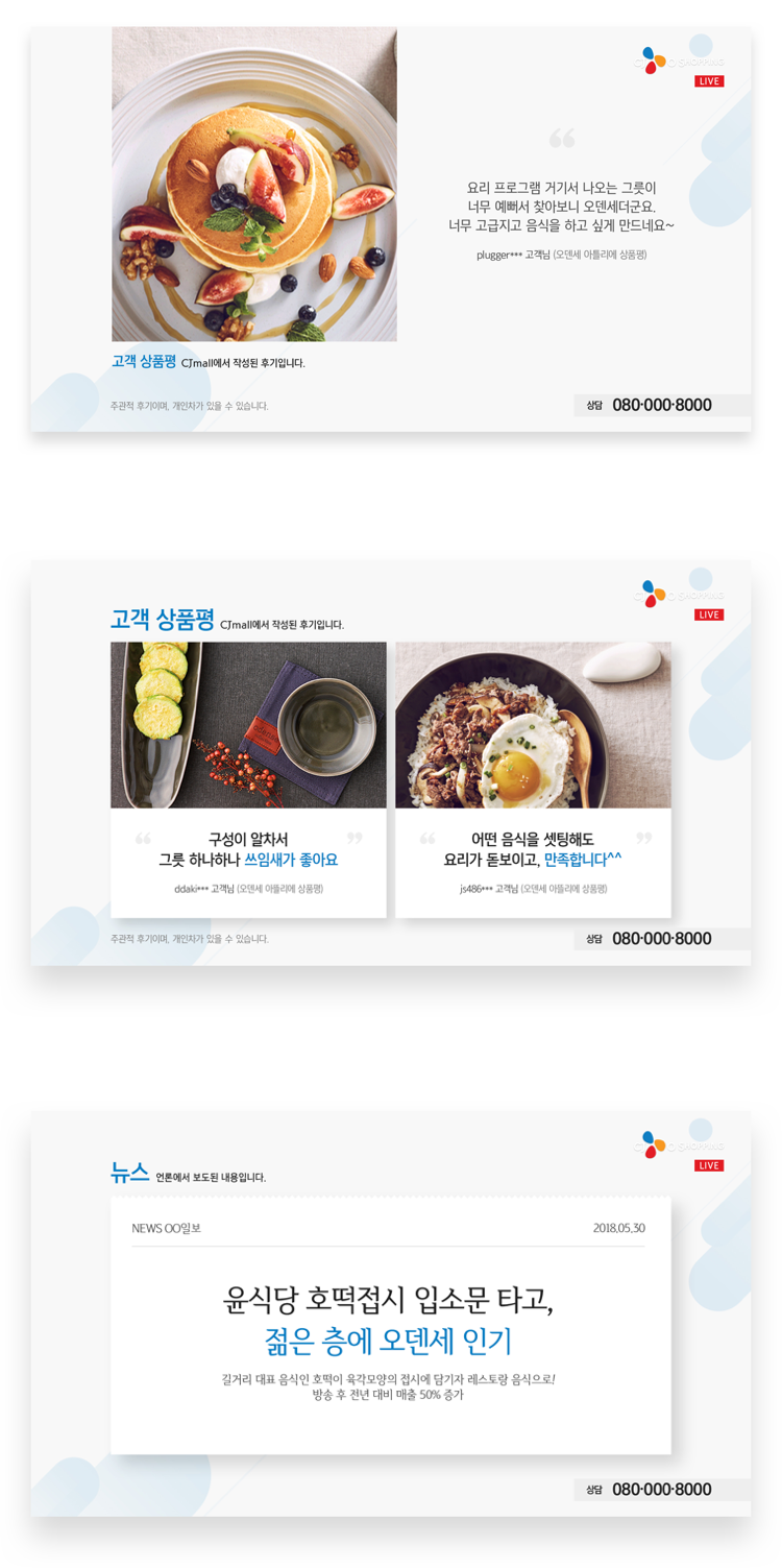
Various front-page features, such as product review, LEC, arrow, full-version, newspaper, and sold-out, are constructed with new graphic patters and motifs of CJ O shopping in consideration of their nature.
Deliberation, show host, guest, scroll, intro, and subtitles have been also reconstructed for the new GUI.
Credits
-
- Creative Director
-
Kim Youngsun
- UI Designer
-
Park Joohyun, Ju Sunyoung, Lee Sieun
-
- Interaction Designer
-
Kim Gisang
Link
Oshopping Plus